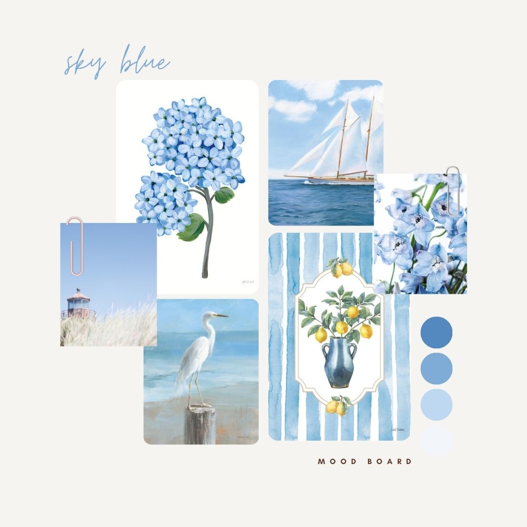
Move over, indigo, there’s a new blue in town, and it’s a breath of fresh, cloudless air. Sky Blue is having a major art licensing main character moment, and if you’re not already obsessed, give it a minute.
You’ve probably seen it floating through your feed. Draped on runways. Popping up in your favorite home stores like it casually lives there. And that’s exactly the point. Sky Blue is gentle enough to glow in a sunroom, strong enough to hold its own in a pattern-heavy powder room, and just nostalgic enough to tap into our collective longing for simpler days.
Why Designers (and Art Buyers) Are Reaching for Sky
In 2025/2026, trendsetters aren’t just picking pretty shades. They’re choosing colors that say something. And Sky Blue says yes to joy, yes to serenity, and yes to stepping away from the moody tones that overstayed their welcome.
This isn’t your grandma’s powder blue. It’s punchier. Smarter. Cooler. Think cerulean, cornflower, and the kind of blue that makes you want to paint your whole life in layers of calm.
Here’s why it works so beautifully in art licensing:
- It pairs like a dream with warm woods, sunny neutrals, or even that splash of tangerine you weren’t sure what to do with
- It lends itself to a range of styles, from coastal abstracts to floral repeats
- It adapts. Whether you’re selling to big-box retailers or indie decor brands, Sky Blue speaks a language they all understand
Plus, it’s the kind of shade that makes a gallery wall look curated without trying too hard. You know, the aesthetic we’re all chasing.

How Sky Blue Is Sneaking into All the Big Art Licensing Trends
Sky Blue isn’t just making a splash, it’s quietly threading its way through some of the biggest style stories of the year. In Mediterranean-inspired interiors, it’s the go-to for those breezy blue stripes we’re seeing on everything from table linens to accent walls. It shows up in hand-painted tiles, rustic ceramics, and patterns that feel like a vacation in Capri.
In the world of Quiet Luxury, Sky Blue adds just the right note of softness. Paired with creams, taupes, and weathered textures, it feels refined without trying too hard. And for that Hampton Chic moment? Sky Blue is practically the dress code, working beautifully with hydrangea prints, chinoiserie-inspired florals, and classic blue-and-white patterns that nod to tradition while still feeling fresh.
Even Coastal is getting a Sky Blue update. Instead of just beachy beige and driftwood tones, we’re seeing a shift toward color-drenched palettes, where seashells, sailboats, and seaside views are washed in calming, watery hues. It’s less nautical cliché, more curated coastal cool.

How Art Licensing Puts Sky Blue to Work
When you license art in this trending hue, you’re not just picking a color. You’re choosing a feeling. A calm, confident, optimistic vibe that plays well across categories.
- Think wall art that softens a minimalist space
- Think dinnerware patterns that look like they belong in a sun-drenched kitchen
- Think canvas prints, giclée editions, and even fabric designs that carry a sense of ease
And because it’s art licensing, you get flexibility. Want to use the same Sky Blue floral on a tote bag and a wallpaper panel? You can. Need a coordinating pattern for textiles? We’ve got it.
At Wild Apple, we keep an eye on what’s trending in fashion, interiors, and all the moodboards in between so that you don’t have to. Sky Blue caught our attention for good reason—it’s the ultimate reset button. Soothing but not sleepy. Fresh but not fussy.
It’s one of those rare colors that earns its spot across seasons, styles, and product lines. And right now, it’s ready for its close-up