Color of the Year season arrives with the same energy as fashion week.
Bold announcements, dramatic predictions, and the collective gasp of everyone who works in design. One minute we are debating Pantone’s Cloud Dancer and WGSN’s Transformative Teal, and the next we are deep in the paint deck, checking what Behr and Benjamin Moore are doing and wondering how all of these shades fit together.
At Wild Apple, we love this moment. Not because we simply follow what the big color houses say, but because it signals a shift in how people around the world want their homes to feel. It is a glimpse into the consumer mood before it hits the aisles, mood boards, and product lines.
Why we pay attention
Colors of the Year are not picked on a whim. Each company pours months of research into social movement, design direction, culture, global events, psychological patterns, and emerging aesthetics. When Pantone calls Cloud Dancer a breath of calm or when WGSN anoints Transformative Teal as a signal of renewal, they are tapping into the emotional energy people are craving.
Behr and Benjamin Moore do the same thing through their own lenses. Behr often leans toward accessible, liveable shades that feel good in real homes. Benjamin Moore’s picks tend to speak to elevated design and architectural finishing. Together, these annual color statements create a useful temperature check that helps manufacturers and retailers understand the emotional tone consumers are moving toward.
We track these releases closely because they help us gauge mood shifts before they fully take hold. They help our team spot early signals that might influence what shoppers reach for next season. And when you license art for home decor products, early clues make a big difference.
Why the research matters
Color is one of the fastest, clearest ways consumers express how they want their spaces to feel. It affects how a room is perceived, how a product sells, and even how a collection is merchandised on a shelf. A single shade can shift a trend. A palette can spark an entire movement.
When global color authorities share their forecasts, they are essentially saying, this is where people will want to go next.
The data behind those choices is enormous. It includes retail analytics, cultural studies, consumer behavior, architecture trends, runway references, and the entire swirl of visual inspiration happening worldwide. These decisions help shape the broader design conversation, which eventually influences home decor, textiles, wallpaper, giftware, wall art, and more.

How it affects home decor and art licensing
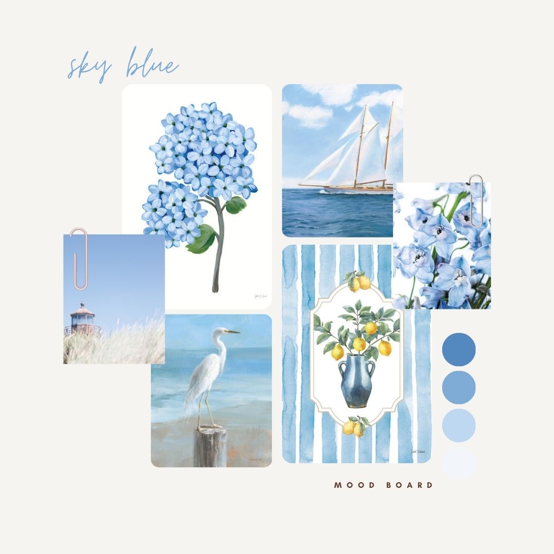
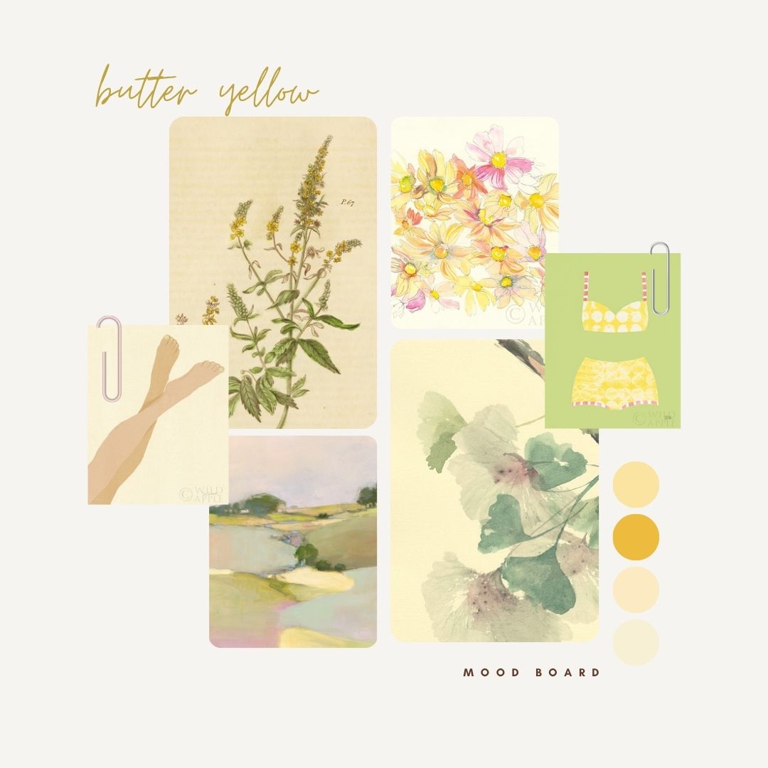
Color is the heartbeat of home decor. When a specific shade starts trending, everything evolves with it. Textiles shift. Tabletop collections shift. Rugs shift. Mustard warms to amber. Sage moves toward eucalyptus. Ocean blues drift into teal.
For art licensing the right palette can turn a good piece into the perfect piece for a product line. Color alignment makes a pattern fit seamlessly into a bedding program or a wall art collection. Color harmony is often the difference between a passing glance and a product that becomes a bestseller.
So when Pantone, WGSN, Behr, and Benjamin Moore share their picks, we listen. But we also look at what is happening in lighting, finishes, interior design, and consumer behavior. We study what shoppers are pinning. We listen to our customers. We collaborate with our artists. We watch which collections sell at retail. And we study what our global manufacturers are asking for.
We do our own research too
Here is the honest part. We do not rely one hundred percent on color forecasts from the major companies. Color predictions set the tone, but they are not the whole story. They are a starting point, not a rulebook.
Retailers do not buy products because a color institute told them to. They buy because the item feels right for their store, their customer, and their brand. Which means our job is to balance the big color announcements with what is actually happening in the real world.
Sometimes the Color of the Year aligns perfectly with what consumers want. Other times, the market goes in a related but slightly different direction. We see this in art licensing all the time. A color forecast might inspire us to explore a softer variant, a richer accent, or a palette extension that fits the trend but actually sells better.
At Wild Apple, we combine color forecasting with live market analysis, retail experience, trend tracking, interior design conversations, constant data from our customers, and a very strong instinct for what will sell. Our team reviews hundreds of new images and trend signals each month to make sure our collections reflect what is coming next rather than what was predicted.
The real takeaway
Colors of the Year matter because they reflect what people are feeling and where design is headed. They give us momentum, inspiration, and a collective language to talk about change. But they are one tool, not the whole toolbox.
The most successful manufacturers, retailers, and designers use these color predictions as a foundation. Then they adapt them to real-life product development, local markets, and brand identity. That is exactly how we approach every collection we publish.
But the most important color story is the one that resonates with consumers and moves product at retail. That is the story we help our customers tell every single day.