Kitchens have always been the center of the home. That’s not new. What is changing is how deliberately they’re being designed, and how much more expressive they’re becoming in the process.
For years, the dominant language was restraint: white surfaces, pale neutrals, hidden storage, seamless finishes. That approach still exists, but it’s no longer the only direction. Today’s kitchens are starting to behave less like controlled environments and more like lived-in creative spaces, layered, personal, and increasingly comfortable with color.
From “Designed to Disappear” to “Designed to Be Seen”
One of the clearest shifts is that kitchens are no longer expected to fade into the background of open-plan homes.
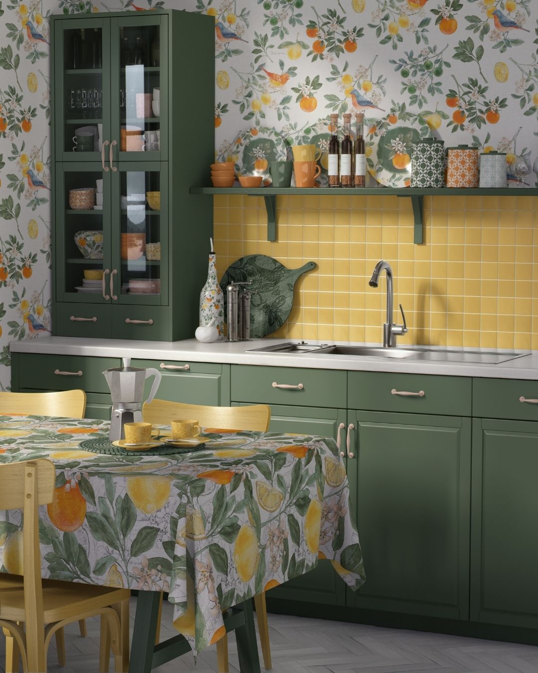
Instead, they’re being treated as visual rooms in their own right. Cabinetry is going bolder. Tile is carrying more personality. Open shelving is turning functional storage into display space. And even small choices, like hardware, textiles, and artwork, are being used to build a more intentional point of view.
This is where color is doing a lot of work.
The Broader Story Behind the “Kitchen Aesthetic”
What’s really driving this is a shift in how people want their homes to feel overall. There’s a move toward interiors that feel collected rather than curated, expressive rather than perfected. Kitchens are simply catching up to that mindset.
That’s why we’re seeing more mixed materials, more visible texture, and more willingness to let objects stay out. It’s also why imagery and surface design are becoming more important again.

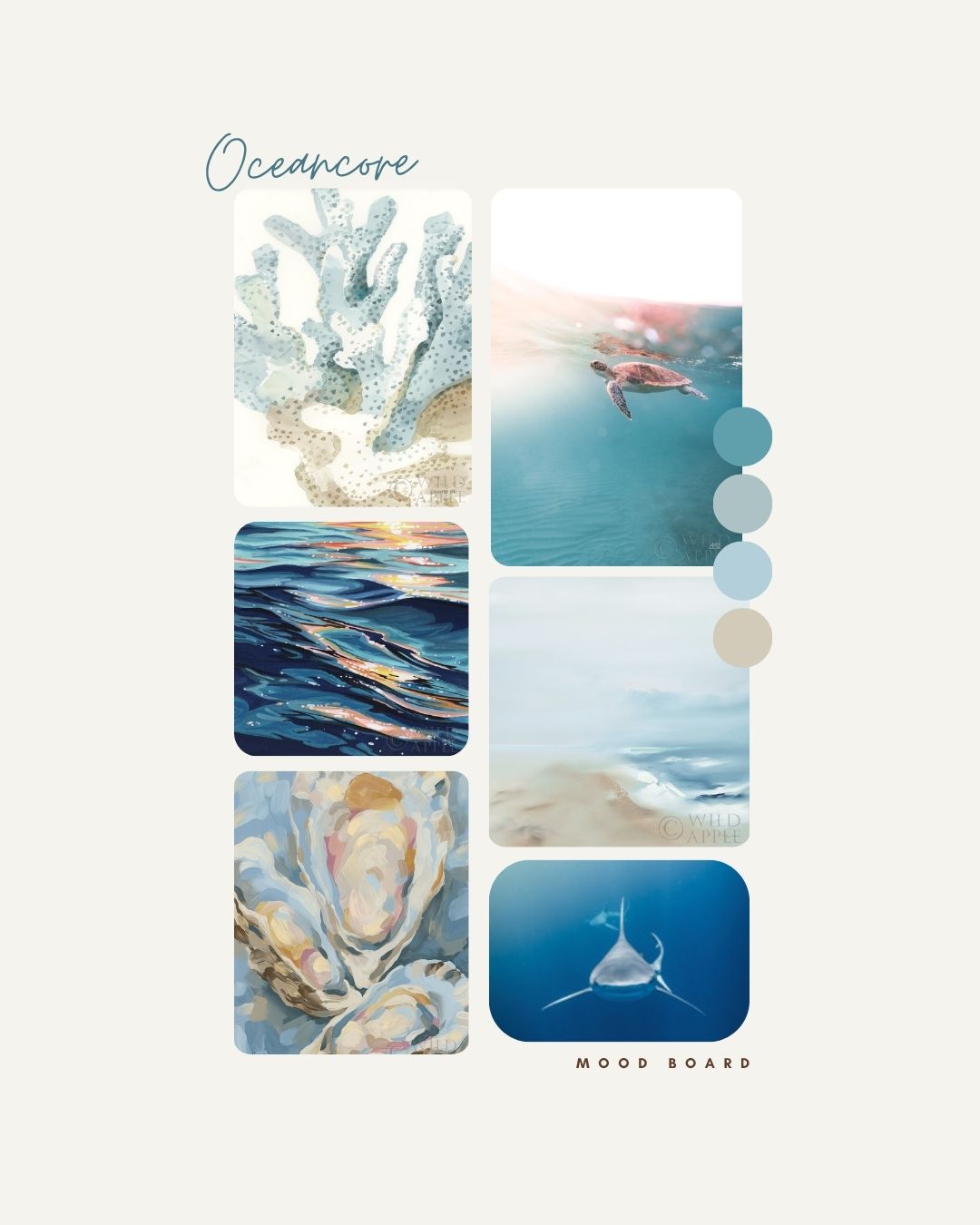
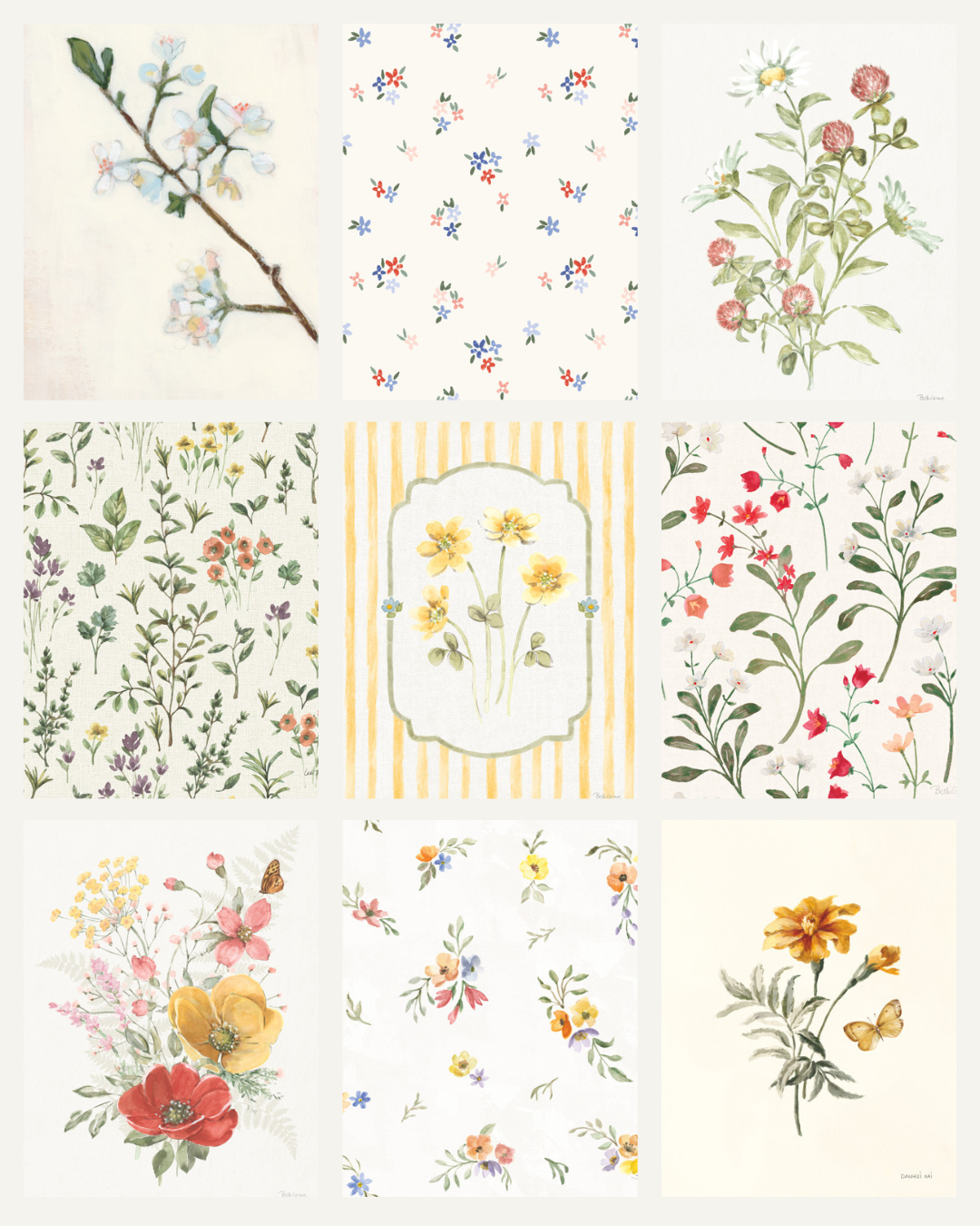
Colorful Art for Kitchens
Traditionally, still life was everything in kitchen art. And while it still is a BIG part, it’s only one expression of a much broader visual shift.
Food-based themes, fruit, produce, table settings, glassware, café culture, continue to resonate because they sit so naturally in the kitchen environment. But the treatment is changing. Instead of traditional, formal compositions, we’re seeing looser, more graphic, more color-forward interpretations.
At the same time, other directions are emerging alongside it: abstracted color fields, painterly florals, simplified pattern work, and editorial and sketchy freestyle illustration. The common thread isn’t subject matter alone, it’s tone.
Color is trending but kitchen renovations are not for the faint of heart. Artwork plays a specific role here: it’s one of the easiest ways to introduce color without commitment. A print or framed piece can shift the temperature of a kitchen instantly, adding warmth, contrast, or freshness, without requiring renovation-level decisions.
Consumers may not renovate kitchens frequently, but they do update them visually, through art, textiles, and smaller decorative shifts. That makes this category particularly responsive to trend cycles without requiring structural change.
Color in the Kitchen at Wild Apple
At Wild Apple, this direction shows up in work that treats food, color, and everyday objects as design material rather than literal subject matter. From expressive still lifes to more graphic, contemporary interpretations of kitchen life, the focus is on creating imagery that adapts easily across wall decor and home product applications.
As kitchens continue to evolve, the most useful artwork won’t just decorate the space, it will help define its mood.