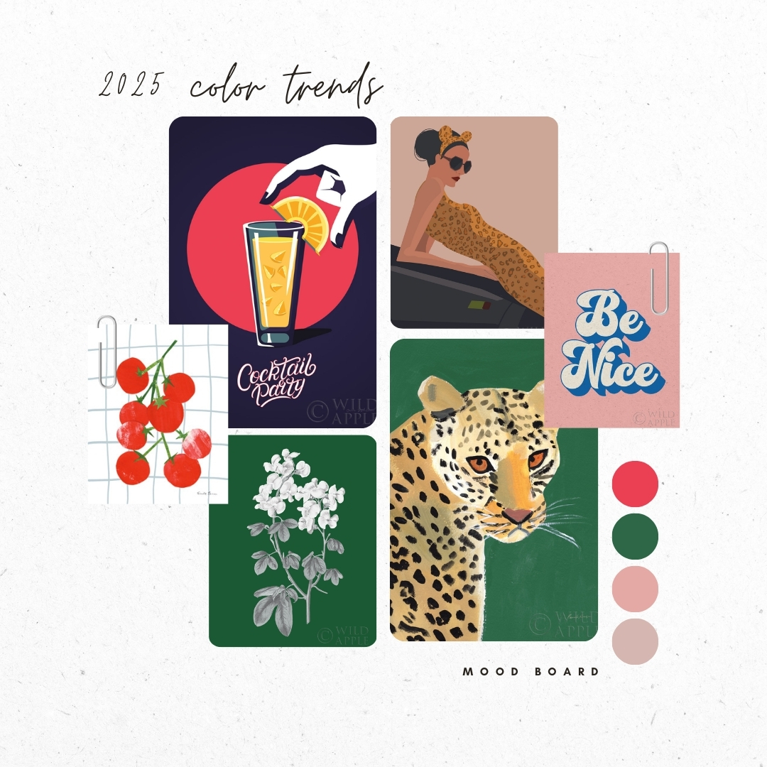
When it comes to art licensing color trends for 2025, it’s all about stepping out of the ordinary and embracing colors that make you do a double take. Picture this: a green so zesty it feels like it came straight from your favorite jar of pickles, a red as bold as a summer cherry pie, and a pink that takes blush tones to a whole new level of sophistication. These aren’t just colors—they’re statements and we’re loving them..
These three hues are making waves in home decor, and if you’re in the business of manufacturing or retailing, it’s time to get on board. Why? Because these colors aren’t just pretty—they’re packed with consumer appeal. Let’s break them down.
Cherry Red: Bold, Bright, and Unapologetic
Cherry Red is 2025’s high-energy showstopper. It’s dramatic, confident, and deeply tied to social trends—Pinterest is calling it out as a favorite among Millennials and Gen Z. This isn’t just a pop of color; it’s a mood. Cherry Red says, “I’m here, and I’m fabulous.”
Why It Matters to Buyers: Consumers are leaning into bold design choices that make them smile, and Cherry Red is at the heart of this trend. For manufacturers and retailers, it’s an opportunity to inject excitement into product lines. This hue thrives in wall decor with striking typography prints, abstract art, or even playful kitchen-inspired illustrations, but its potential goes far beyond that. Imagine Cherry Red woven into bedding patterns, dinnerware sets with striking red accents, or bold, graphic fabric prints for pillows and curtains. Even small details, like stationery with red floral or geometric motifs, can pack a visual punch.
Where It Fits: Cherry Red works beautifully across an array of home and lifestyle products. Picture glossy red dinner plates that make every meal feel festive, cherry-patterned throw pillows that brighten living rooms, or vibrant towels that add energy to neutral bathrooms. For art licensing, it’s perfect for bold abstract canvases, vintage-inspired wall art, or quirky illustrations that pop on everything from calendars to cocktail napkins. Whether as a lead color or a vibrant accent, Cherry Red delivers a fresh, joyful look that consumers can’t resist.
-

Title: Fresh Tomatoes II
Artist: Farida ZamanSKU: 95156 - d SID32482Title: Fresh Tomatoes II
Artist: Farida ZamanSID32482SKU: 95156 - dAll of our in-stock prints are printed on premium 80 lb cover paper.Buy Prints add to portfolio copy product linkview collectionmust be signed in for these actions
sign in here »Loading... -

Title: Woodland Love Red Mushroom
Artist: Beth GroveSKU: 87841 - a SID28991JTitle: Woodland Love Red Mushroom
Artist: Beth GroveSID28991JSKU: 87841 - aAll of our in-stock prints are printed on premium 80 lb cover paper.Buy Prints add to portfolio copy product linkview collectionmust be signed in for these actions
sign in here »Loading... -

Title: Love Each Other
Artist: Becky ThornsSKU: 64288 - b SID26133Title: Love Each Other
Artist: Becky ThornsSID26133SKU: 64288 - bAll of our in-stock prints are printed on premium 80 lb cover paper.Buy Prints add to portfolio copy product linkview collectionmust be signed in for these actions
sign in here »Loading... -

Title: Modern Petals V
Artist: Veronique CharronSKU: 89109 - a SID30899JTitle: Modern Petals V
Artist: Veronique CharronSID30899JSKU: 89109 - aAll of our in-stock prints are printed on premium 80 lb cover paper.Buy Prints add to portfolio copy product linkview collectionmust be signed in for these actions
sign in here »Loading... -

Title: Love Letters VIII Deep Red
Artist: Becky ThornsSKU: 70517 - a SID27151Title: Love Letters VIII Deep Red
Artist: Becky ThornsSID27151SKU: 70517 - aAll of our in-stock prints are printed on premium 80 lb cover paper.Buy Prints add to portfolio copy product linkview collectionmust be signed in for these actions
sign in here »Loading... -

Title: Cocktail Party
Artist: Omar EscalanteSKU: 63989 - f SID26038Title: Cocktail Party
Artist: Omar EscalanteSID26038SKU: 63989 - fAll of our in-stock prints are printed on premium 80 lb cover paper.Buy Prints add to portfolio copy product linkview collectionmust be signed in for these actions
sign in here »Loading... -

Title: Pink and Red Florals
Artist: Farida ZamanSKU: 32160 - a SID22091Title: Pink and Red Florals
Artist: Farida ZamanSID22091SKU: 32160 - aAll of our in-stock prints are printed on premium 80 lb cover paper.Buy Prints add to portfolio copy product linkview collectionmust be signed in for these actions
sign in here »Loading... -

Title: Pacific Sea Mosses I Red
Artist: Wild Apple PortfolioSKU: 55916 - a SID16602Title: Pacific Sea Mosses I Red
Artist: Wild Apple PortfolioSID16602SKU: 55916 - aAll of our in-stock prints are printed on premium 80 lb cover paper.Buy Prints add to portfolio copy product linkview collectionmust be signed in for these actions
sign in here »Loading...
Dill Green: Pickle Chic with a Twist
Move over sage, there’s a new green in town, and it’s as zesty as it sounds. Dill Green is the quirky, fresh shade you didn’t know you needed. It’s bold enough to stand out but grounded enough to feel familiar. This color taps into the pickle-obsessed foodie culture, trickling into everything from artisanal cocktails to modern kitchens.
Why It Matters to Buyers: Consumers are drawn to colors that feel both bold and approachable, and Dill Green hits the sweet spot. For manufacturers, it offers endless versatility, pairing beautifully with natural wood tones, metallics, and even darker greens for a layered effect. Beyond lacquered cabinets and velvet accent chairs, this color comes alive across a range of home products. Picture botanical-printed bedding in lush Dill Green hues, or fabric patterns for upholstered chairs that balance classic and contemporary vibes.
Where It Fits: Dill Green lends itself beautifully to tableware—think dishes with a soft green glaze or dinner napkins with leafy designs. For bathware, green floral shower curtains or patterned towels can tie in the trend. Stationery? A perfect hue for botanical-inspired notebooks and planners. And, of course, wall decor: green ironstone-inspired patterns or oversized botanical prints make striking additions to any collection. Dill Green is adaptable, trendy, and a surefire hit for buyers looking to capture the consumer craving for something fresh yet grounded.
-

Title: Oliva
Artist: Wellington StudioSKU: 87331 - d SID30480Title: Oliva
Artist: Wellington StudioSID30480SKU: 87331 - dAll of our in-stock prints are printed on premium 80 lb cover paper.Buy Prints add to portfolio copy product linkview collectionmust be signed in for these actions
sign in here »Loading... -

Title: Green Botanical III
Artist: Wild Apple PortfolioSKU: 68869 - d SID21851Title: Green Botanical III
Artist: Wild Apple PortfolioSID21851SKU: 68869 - dAll of our in-stock prints are printed on premium 80 lb cover paper.Buy Prints add to portfolio copy product linkview collectionmust be signed in for these actions
sign in here »Loading... -

Title: Delighted III Emerald
Artist: Moira HersheySKU: 80200 - a SID28992NRTitle: Delighted III Emerald
Artist: Moira HersheySID28992NRSKU: 80200 - aAll of our in-stock prints are printed on premium 80 lb cover paper.Buy Prints add to portfolio copy product linkview collectionmust be signed in for these actions
sign in here »Loading... -

Title: Cripple Creek
Artist: Julia PurintonSKU: 20919 - a SID20093Title: Cripple Creek
Artist: Julia PurintonSID20093SKU: 20919 - aAll of our in-stock prints are printed on premium 80 lb cover paper.Buy Prints add to portfolio copy product linkview collectionmust be signed in for these actions
sign in here »Loading... -

Title: Colorful Cheetah on Emerald
Artist: Pamela MungerSKU: 76923 - d SID27155Title: Colorful Cheetah on Emerald
Artist: Pamela MungerSID27155SKU: 76923 - dAll of our in-stock prints are printed on premium 80 lb cover paper.Buy Prints add to portfolio copy product linkview collectionmust be signed in for these actions
sign in here »Loading... -

Title: Nature Story II
Artist: Laura HornSKU: 72220 - f SID27815Title: Nature Story II
Artist: Laura HornSID27815SKU: 72220 - fAll of our in-stock prints are printed on premium 80 lb cover paper.Buy Prints add to portfolio copy product linkview collectionmust be signed in for these actions
sign in here »Loading... -

Title: Emerald Banana Leaves II
Artist: Janelle PennerSKU: 82388 - b SID21680Title: Emerald Banana Leaves II
Artist: Janelle PennerSID21680SKU: 82388 - bAll of our in-stock prints are printed on premium 80 lb cover paper.Buy Prints add to portfolio copy product linkview collectionmust be signed in for these actions
sign in here »Loading... -

Title: Chinoiserie III Green
Artist: Farida ZamanSKU: 45964 - a SID23263Title: Chinoiserie III Green
Artist: Farida ZamanSID23263SKU: 45964 - aAll of our in-stock prints are printed on premium 80 lb cover paper.Buy Prints add to portfolio copy product linkview collectionmust be signed in for these actions
sign in here »Loading...
Plaster Pink: The New Neutral
Plaster Pink is where sophistication meets softness. This muted, dusty pink moves beyond the blush trends of the past, offering a more nuanced and versatile approach. It’s a color that feels luxurious yet approachable, making it a go-to for consumers seeking elegance without fuss.
Why It Matters to Buyers:
This pink is a chameleon—it adapts beautifully to a wide range of products and styles. For consumers, it brings warmth and serenity to their spaces. For manufacturers and retailers, Plaster Pink’s versatility makes it a top choice for everything from bedding to stationery. In wall decor, it works seamlessly with earthy palettes, metallic accents, and other neutrals. Think vintage-inspired botanical prints, intricate abstract florals, or textured art that adds depth. Beyond wall art, it shines in fabric patterns for throw pillows, table linens, or curtains, and in ceramics or dinnerware with subtle pink glazes.
Where It Fits:
Plaster Pink’s adaptability knows no bounds. It’s a natural fit for bedroom textiles like duvet covers and cushions, or soothing bathroom accessories such as towels and shower curtains. For hospitality settings, large-scale wall art in soft pink tones can create a tranquil atmosphere, while stationery products featuring blush-inspired designs can appeal to both casual and upscale audiences. Whether as a focal point or a gentle accent, Plaster Pink offers timeless appeal that resonates across industries.
-

Title: Petal Passion XI
Artist: Beth GroveSKU: 70850 - a SID27275JTitle: Petal Passion XI
Artist: Beth GroveSID27275JSKU: 70850 - aAll of our in-stock prints are printed on premium 80 lb cover paper.Buy Prints add to portfolio copy product linkview collectionmust be signed in for these actions
sign in here »Loading... -

Title: Eventide Desert Sunrise I
Artist: Becky ThornsSKU: 70976 - h SID27236Title: Eventide Desert Sunrise I
Artist: Becky ThornsSID27236SKU: 70976 - hAll of our in-stock prints are printed on premium 80 lb cover paper.Buy Prints add to portfolio copy product linkview collectionmust be signed in for these actions
sign in here »Loading... -

Title: Be the Good Dusty Rose
Artist: Becky ThornsSKU: 66176 - b SID26133Title: Be the Good Dusty Rose
Artist: Becky ThornsSID26133SKU: 66176 - bAll of our in-stock prints are printed on premium 80 lb cover paper.Buy Prints add to portfolio copy product linkview collectionmust be signed in for these actions
sign in here »Loading... -

Title: Lake Superior Clouds IV
Artist: Alan MajchrowiczSKU: 50387 - h SID23972Title: Lake Superior Clouds IV
Artist: Alan MajchrowiczSID23972SKU: 50387 - hAll of our in-stock prints are printed on premium 80 lb cover paper.Buy Prints add to portfolio copy product linkview collectionmust be signed in for these actions
sign in here »Loading... -

Title: Delicate Orchid I
Artist: Danhui NaiSKU: 76095 - f SID28538RWTitle: Delicate Orchid I
Artist: Danhui NaiSID28538RWSKU: 76095 - fAll of our in-stock prints are printed on premium 80 lb cover paper.Buy Prints add to portfolio copy product linkview collectionmust be signed in for these actions
sign in here »Loading... -

Title: Gorgeous Wild I
Artist: Omar EscalanteSKU: 71785 - h SID27665Title: Gorgeous Wild I
Artist: Omar EscalanteSID27665SKU: 71785 - hAll of our in-stock prints are printed on premium 80 lb cover paper.Buy Prints add to portfolio copy product linkview collectionmust be signed in for these actions
sign in here »Loading... -

Title: Midnight Moon I
Artist: Moira HersheySKU: 90911 - a SID29793NRTitle: Midnight Moon I
Artist: Moira HersheySID29793NRSKU: 90911 - aAll of our in-stock prints are printed on premium 80 lb cover paper.Buy Prints add to portfolio copy product linkview collectionmust be signed in for these actions
sign in here »Loading... -

Title: Crimson Waves
Artist: Silvia VassilevaSKU: 38246 - a SID22787Title: Crimson Waves
Artist: Silvia VassilevaSID22787SKU: 38246 - aAll of our in-stock prints are printed on premium 80 lb cover paper.Buy Prints add to portfolio copy product linkview collectionmust be signed in for these actions
sign in here »Loading... -

Title: Be Nice
Artist: Wild Apple PortfolioSKU: 65523 - d SID26415Title: Be Nice
Artist: Wild Apple PortfolioSID26415SKU: 65523 - dAll of our in-stock prints are printed on premium 80 lb cover paper.Buy Prints add to portfolio copy product linkview collectionmust be signed in for these actions
sign in here »Loading...
Why These Art Licensing Colors Matter for 2025 Home Decor
Consumers are craving connection, emotion, and a touch of escapism in their homes. Colors like Dill Green, Cherry Red, and Plaster Pink tick all the boxes—they’re fresh, vibrant, and just unexpected enough to feel exciting. For manufacturers and retail buyers, these shades offer endless opportunities to innovate product lines and captivate customers.
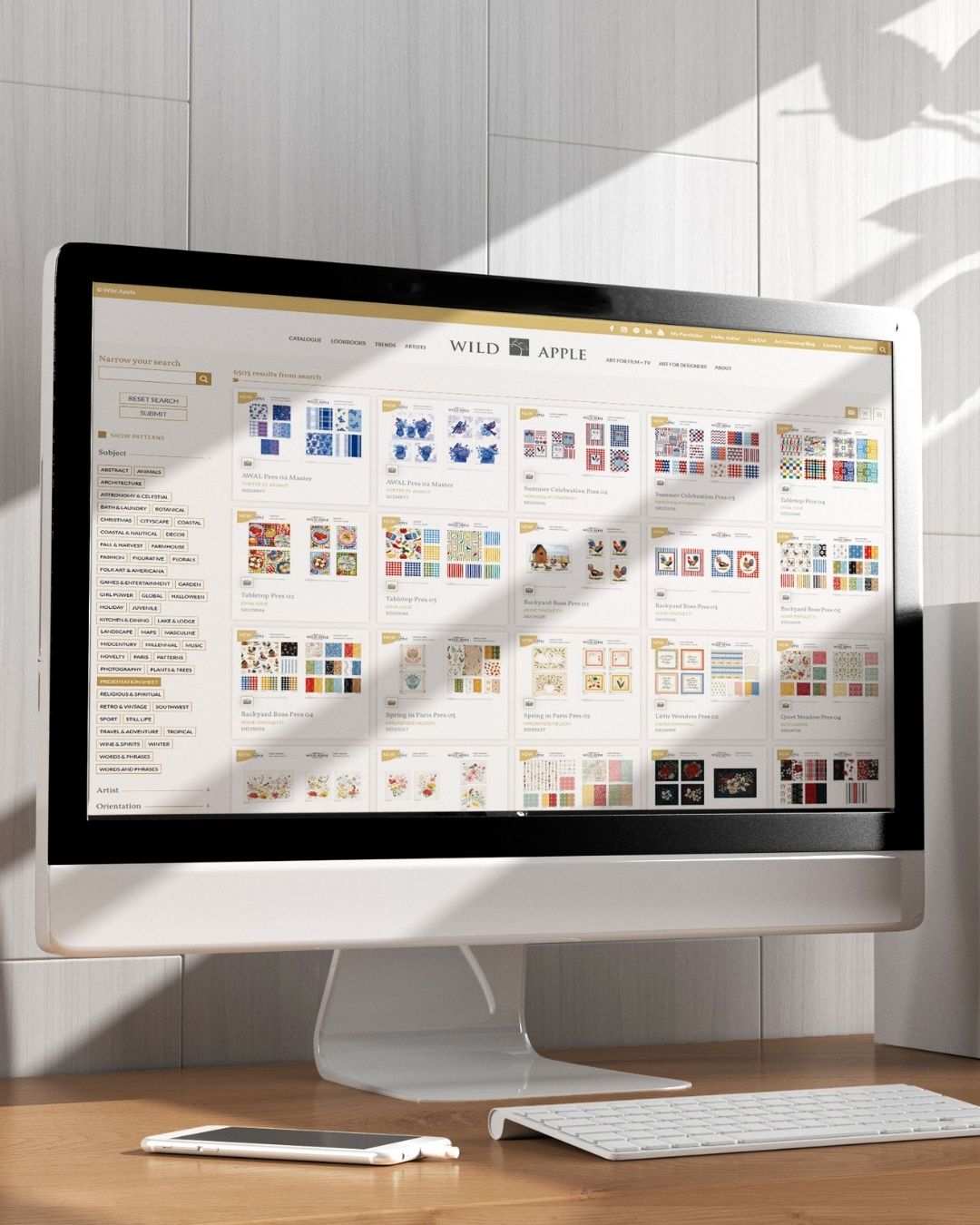
At Wild Apple, we make it easy to incorporate these hues into your product collections. From high-res files for custom wall decor to curated art trends tailored for your audience, we’ve got the tools to help you bring these colors to life. So, what are you waiting for? Let’s paint 2025 in Dill Green, Cherry Red, and Plaster Pink.


