Summary
Fresh, optimistic and surprisingly versatile, Celery SW 6421 is Sherwin-Williams’ 2027 Color of the Year. This soft herbal green feels connected to nature without slipping into familiar sage territory, opening up plenty of possibilities for wall art, textiles, tabletop, accessories and home decor collections. Here is how we see Celery moving beyond the paint aisle and into the wider world of interior design.
A Fresh Take on Green
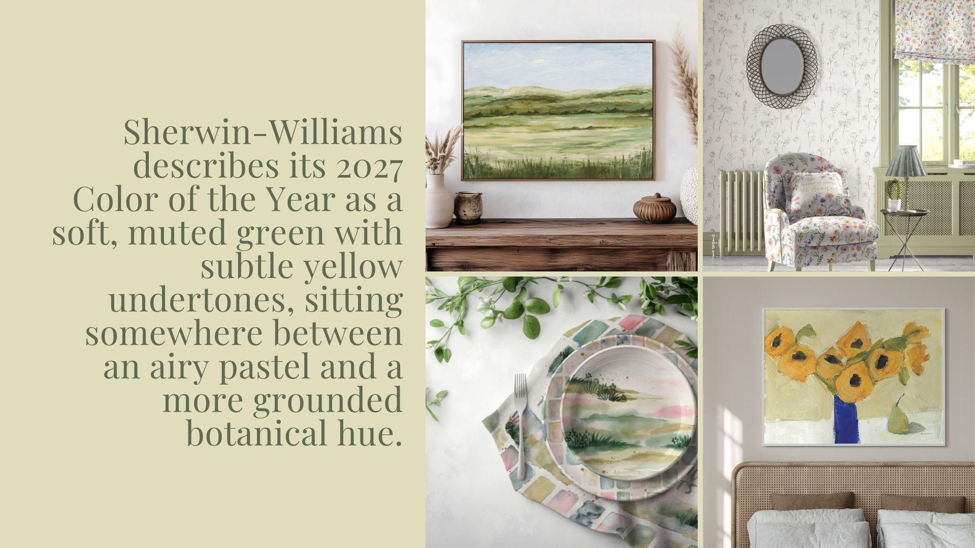
Green has been having a very long moment in interiors, but Celery gives us something a little different. Sherwin-Williams describes its 2027 Color of the Year as a soft, muted green with subtle yellow undertones, sitting somewhere between an airy pastel and a more grounded botanical hue.
After several years dominated by sage, olive and deep forest greens, Celery feels lighter and more optimistic. It still gives us the connection to nature that has made green so enduring, but there is a sunlit quality to it.
For wall and home decor, that makes Celery incredibly usable. Florals, landscapes, botanicals, abstracts and nature inspired designs can pull the color through a room without everything feeling overly coordinated. It can appear as a dominant color in artwork or simply as a soft green accent that connects art to painted walls, upholstery, rugs or decorative accessories.
What Colors Look Best With Celery?
This is where Celery gets interesting.
The obvious companions are warm whites, creams, oatmeal, linen and natural wood tones. They keep the palette soft, organic and relaxed. Sherwin-Williams includes White Flour, Cocoon, Woven Wicker and Pickled Oak in its coordinating palette, reinforcing this warmer, natural approach.
But Celery can handle considerably more color than you might expect.
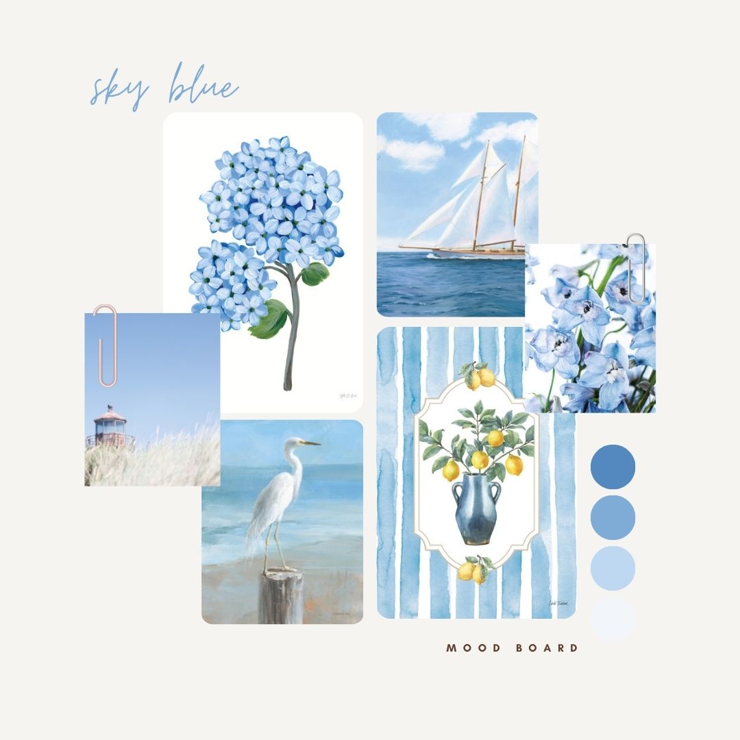
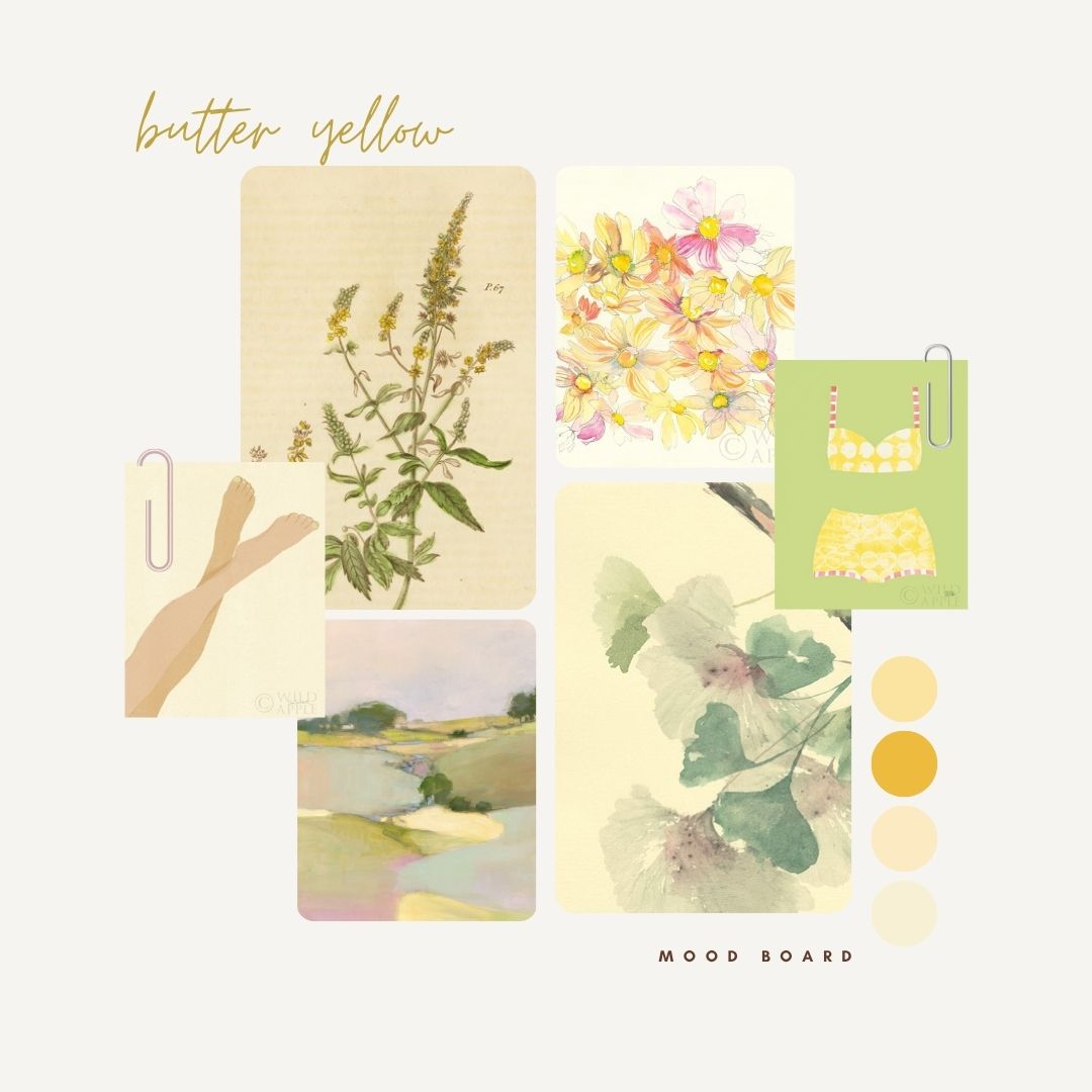
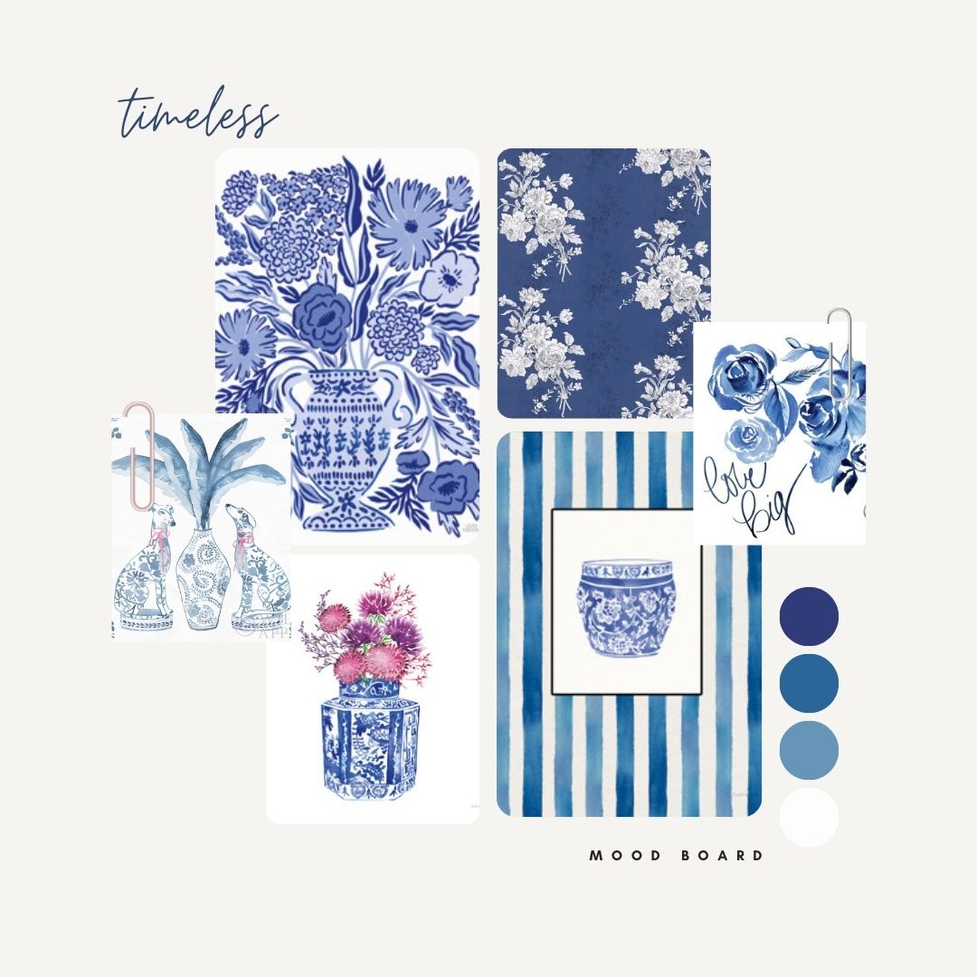
Deep olive and botanical greens give it depth, while sky blue, denim, turquoise and deeper blue tones create a fresh, nature-inspired combination. Warm ochre, butter yellow and golden tones pick up Celery’s subtle yellow undertone beautifully.
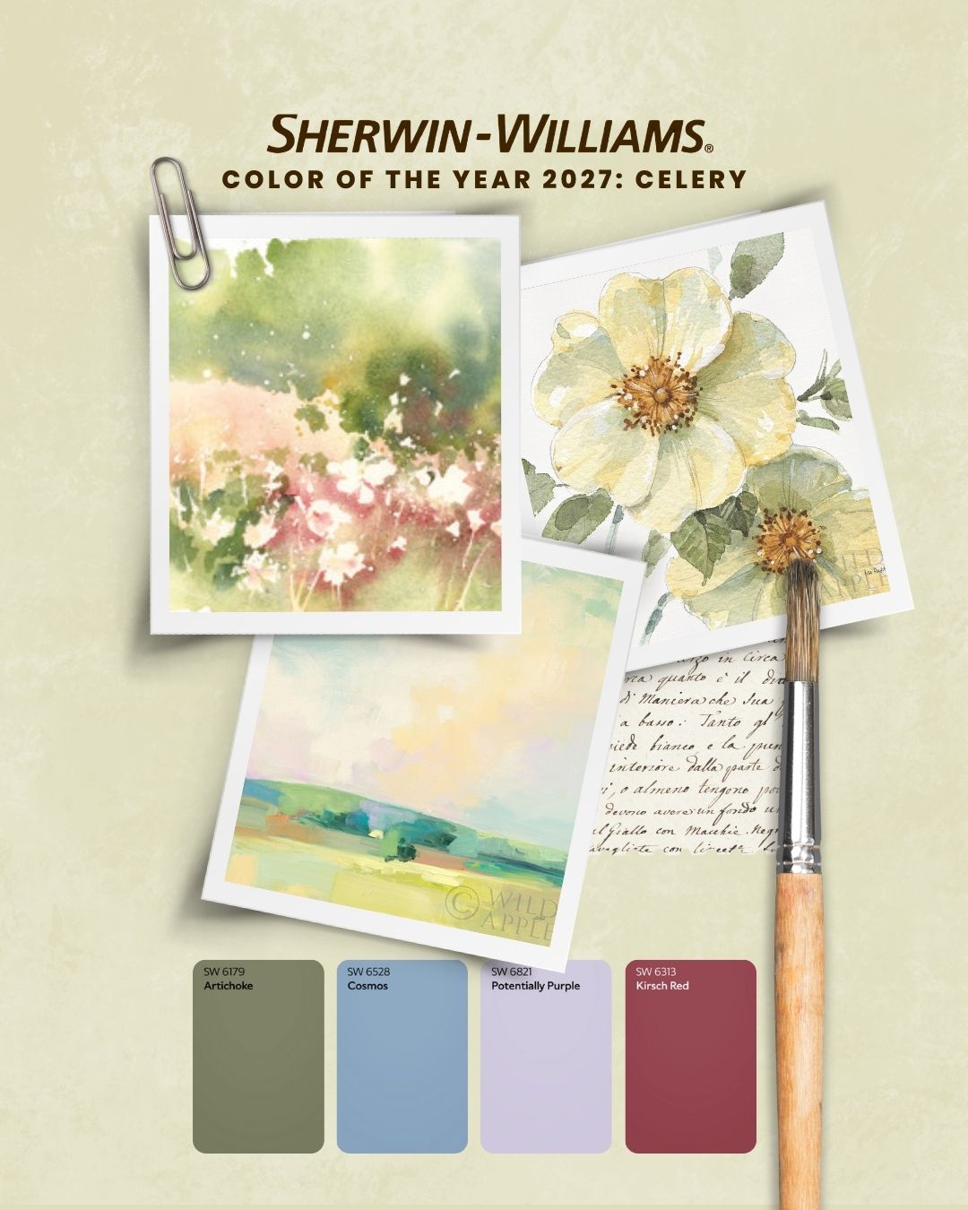
Then there are the more unexpected pairings. Sherwin-Williams’ supporting palette includes Kirsch Red, Potentially Purple, Plum Brown and Georgian Bay, suggesting a much richer approach to styling Celery than simply surrounding it with beige.
That opens the door for coral florals, cobalt accents, rich berry tones, vintage botanical palettes and expressive abstracts. For manufacturers and designers, it means Celery can move from quiet spa-inspired collections to much more colorful, personality-driven product stories.
From Wall Art to a Whole Home Decor Story
Color trends become especially valuable when they can move across categories, and Celery has that versatility.
In wall decor, look for watercolor botanicals, loose florals, abstract landscapes, soft geometric designs and vintage inspired nature studies. Artwork does not need to feature Celery as its dominant color. A touch of herbal green may be enough to connect a piece to the larger palette.
The same thinking can extend into textiles, rugs, bedding, wallpaper, tabletop, stationery and decorative accessories. Imagine Celery paired with cream florals on a duvet, botanical motifs across dinnerware, painterly green patterns on textiles or a soft landscape translated into oversized wall art.
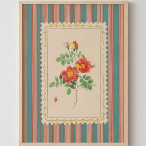
There is also an interesting traditional story emerging here. Sherwin Williams notes that Celery can work across contemporary, transitional, heritage-inspired, and nature-driven spaces. That makes vintage florals, botanical illustrations, garden imagery and classic decorative motifs particularly relevant, especially when they are refreshed with cleaner backgrounds, unexpected color or updated scale.
The Wild Apple Take
What makes Celery exciting is not simply that green is trending, it is how green is changing.
We are moving toward colors that feel natural but not overly earthy, calming but not dull, and nostalgic without becoming overly traditional. Celery lands beautifully in that space.
For art and home decor, we see plenty of opportunities to pair it with creamy neutrals, fresh blues, botanical greens, sunny yellows and even hits of coral, berry and purple. The result feels collected, creative and very easy to bring into the home.
Looking for artwork inspired by the latest color and home decor trends? Explore the Wild Apple collection or contact our team to curate art for your next wall decor or home decor collection.
Frequently Asked Questions
- What is the Sherwin Williams 2027 Color of the Year?
Sherwin Williams selected Celery SW 6421, a soft herbal green with subtle yellow undertones, as its 2027 Color of the Year. - What colors go with Celery green?
Celery works beautifully with warm white, cream, oatmeal, natural wood, olive, blue, golden yellow and brown. For a more expressive palette, try coral, red, plum or purple accents. - What type of wall art works with Celery green walls?
Botanical art, florals, landscapes, abstracts and vintage inspired artwork all work particularly well. Art can repeat the green or introduce complementary colors such as blue, cream, yellow, coral and deeper earthy tones. - Is Celery a warm or cool green?
Celery has subtle yellow undertones, giving it more warmth than many of the sage and blue green shades that have dominated recent interior palettes.