Let’s be honest. Color is having a moment, and we love to see it. Bold kitchens, jewel-toned sofas, moody painted ceilings. Interiors are braver, moodier, and more expressive than ever. But that doesn’t mean neutral is out. Not even close.
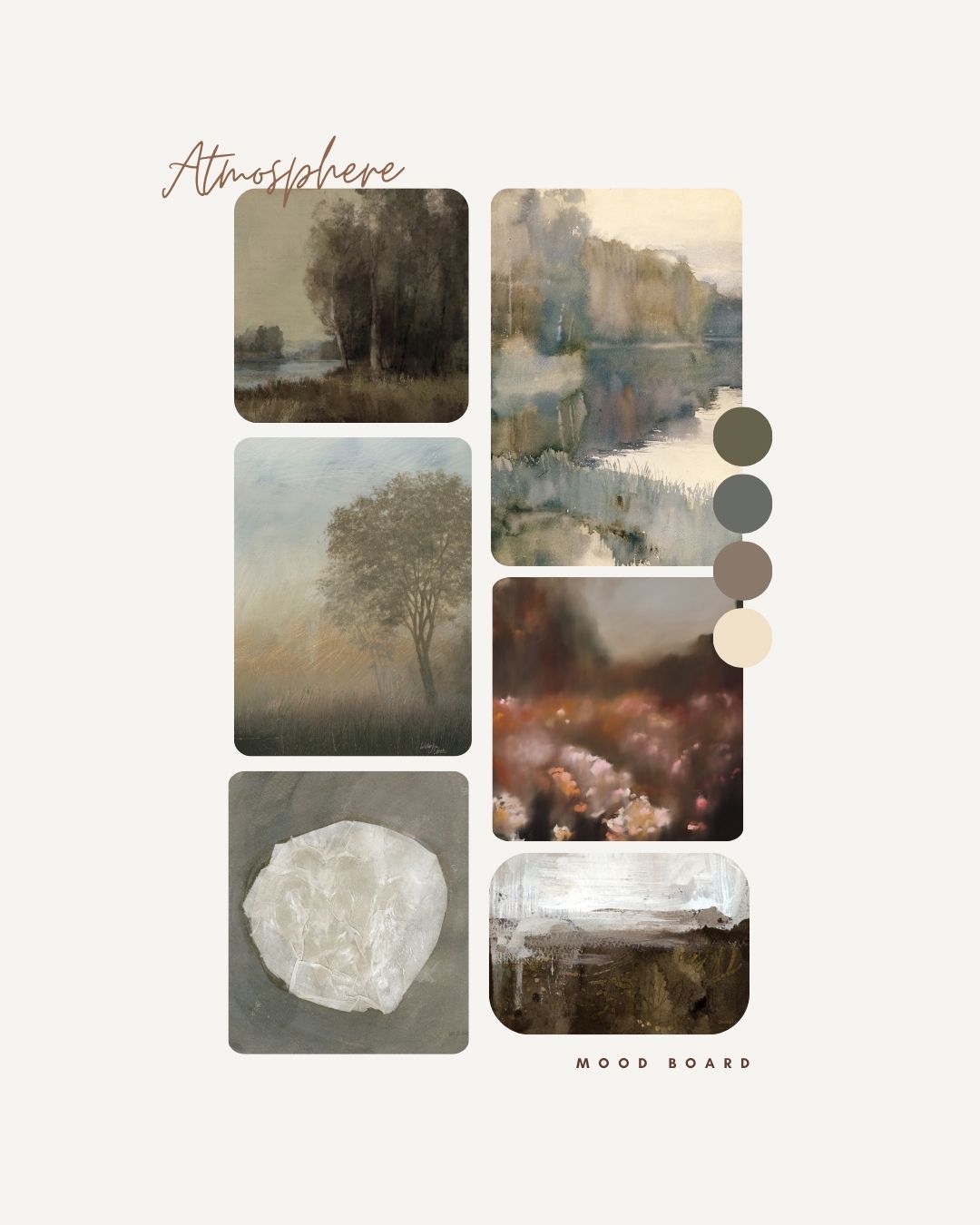
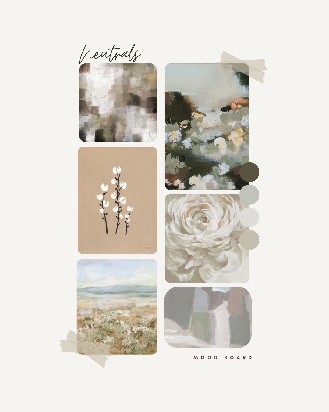
What’s changing is what we mean when we say “neutral.” Gone are the days of stark white everything or cool-toned greys dominating every surface. Today’s neutrals are warmer, richer, more complex. Think parchment and oatmeal. Flax and driftwood. Mushroom, sandstone, ecru, bone, linen. The palette is evolving and so is the art.
And for art licensing, that evolution matters.
Neutral art isn’t background. It’s the atmosphere. It gives a room breathing space. It’s what makes a space feel layered, lived-in, and intentional. Whether abstract or figurative, textured or tonal, neutral wall decor is the foundation that makes bold accents shine and minimalist spaces feel serene instead of stark.
Why Neutral Art Is Still a Retail Powerhouse
For manufacturers, neutral artwork remains a top seller because it works across so many product lines and environments. A gallery wall. A hotel suite. A new home build or a model condo. Neutrals are the flexible friend that everyone invites in.
And when the artwork brings painterly texture, organic shapes, or subtle pattern, it elevates without overpowering. That kind of nuance is what customers are craving. Something soothing but not boring. Calm, but never cold.
Interior designers still reach for neutral art to create that sense of softness and space. The difference now? They’re looking for neutrals with personality. Something that feels curated and collected, not copied and pasted.

From Soft Palettes to Soft Surfaces
The neutral story isn’t just about color. It’s about feeling. That’s why we’re seeing so many wall decor products lean into tactile textures, natural materials, and hand-finished looks. Think canvas prints with visible brush strokes. Raw wood frames. Watercolor washes. Layered shapes in soft-edged neutrals.
Neutrals now feel artisanal. Grounded. A little bit vintage. A little bit undone.
At retail, that makes them perfect for collections that want to signal quality, calm, and sophistication. Especially as shoppers turn away from overproduction and toward slower, more intentional purchases.
Yes, Pantone Had Thoughts Too
Pantone’s pick of Cloud Dancer for its 2026 Color of the Year surprised a lot of people—including us. But the more we thought about it, the more we saw the opportunity. A color like Cloud Dancer isn’t the hero of the room. It’s the canvas. The clean backdrop that makes everything else possible.
We pulled together a curated art collection that celebrates that feeling. Not stark, not sterile—just a beautiful place to start. You’ll see soft creams, layered off-whites, and grounded tonal work that speaks to the new era of neutral.
But it’s not just about following Pantone. It’s about knowing what your customers are reaching for. Art that feels calming. Color that feels considered. Styles that are easy to pair with natural woods, linen upholstery, stone counters, and clay-toned ceramics. That’s the real neutral story.
Why Licensing Neutrals Makes Sense
For manufacturers and retailers, licensing neutral art delivers on all fronts:
- It sells across seasons and styles
- It complements bold color stories in product development
- It works in multiple sizes and formats
- It feels fresh every year with just a shift in texture or tone
And the best part? You’re not boxed in. A great neutral doesn’t go out of style. You can build entire collections around it or let it quietly support your showstoppers.
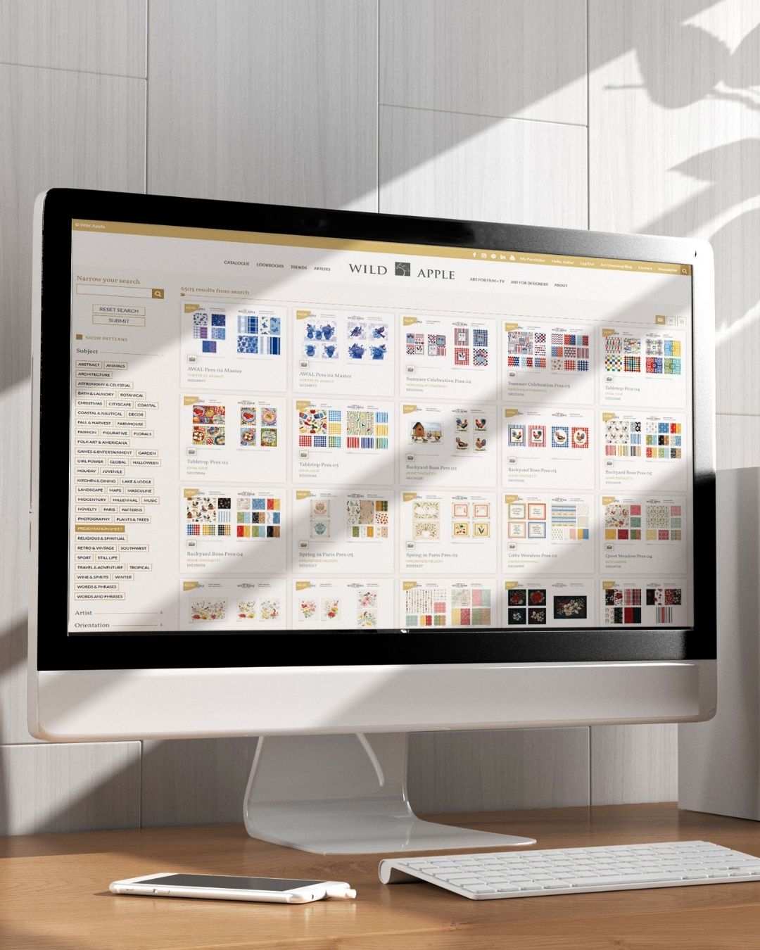
Wild Apple’s neutral collections are designed with exactly that in mind. Created by working artists, built for the retail world. Files are available in multiple sizes, perfect for wall murals, framed prints, and more. Whether you print on paper, canvas, or wood, the files are flexible, the quality is outstanding, and the art is trend-aware without being trendy.