Summary
Holiday art is having some fun with color. From playful pinks and cheerful brights to cozy earthy tones, explore three palettes that bring a fresh feel to Christmas art and seasonal home decor collections.
We love a classic red and green Christmas. But there’s something fun about seeing familiar holiday favorites in a different palette. A pink Santa, a rainbow of ornaments or a snowy cottage painted in warm earthy tones can make you look at Christmas art a little differently.
For manufacturers and retailers planning seasonal home decor collections, color is a great place to start. It can give a favorite subject a new personality and help shoppers find holiday pieces that feel like their style. Here are three color directions worth exploring.
Pretty in Pink: A Playful Take on Christmas Art
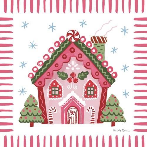
Pink brings a little unexpected charm to the holidays. Think rosy ornaments, and gingerbread houses with touches of berry and cream. Softer shades can feel sweet and nostalgic, while brighter pinks give familiar subjects a cheeky twist.
There’s plenty of room to play, whether the collection leans traditional, whimsical or somewhere in between. For Christmas art licensing, pink offers a cheerful starting point for gift wrap, stationery, tabletop and decorative accessories, with coordinating stripes and small patterns helping pull the look together.
Merry and Bright: Holiday Color with Personality
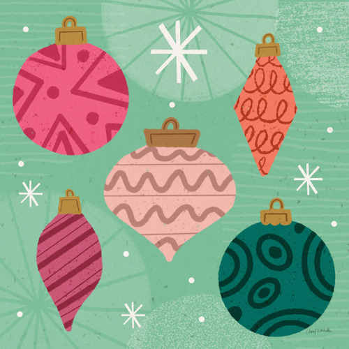
Some holiday collections are ready to turn up the color. Cherry red, turquoise, sunny yellow, vivid green and punchy pink make a lively mix, especially with playful lettering, bold shapes and expressive artwork.
Imagine colorful ornaments scattered across gift wrap or a row of Christmas trees, each with its own personality. The palette doesn’t need to appear in full on every product. A few colors can lead on one piece, with the others picked up in coordinating designs. That gives manufacturers plenty of ways to build a festive collection that feels connected and gives shoppers permission to have a little fun with their decorating.
Earthy Tones: A Cozy Direction for Holiday Home Decor
Warm browns, muted greens, terracotta and creamy whites bring a quieter kind of holiday charm.
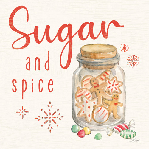
Picture woodland animals, leafy wreaths and essential gingerbread in colors that feel at home alongside natural wood and soft textiles. The artwork can still be full of festive detail, from a beautifully painted pine branch to a ribbon tied around a simple botanical arrangement.
These earthy tones work well for shoppers who like their seasonal decorations to blend with the rest of their home. Across wall decor, kitchen textiles, tabletop and giftware, they offer a warm, relaxed way to welcome the holidays.
Find Holiday Art Licensing Collections for Your Next Product Line
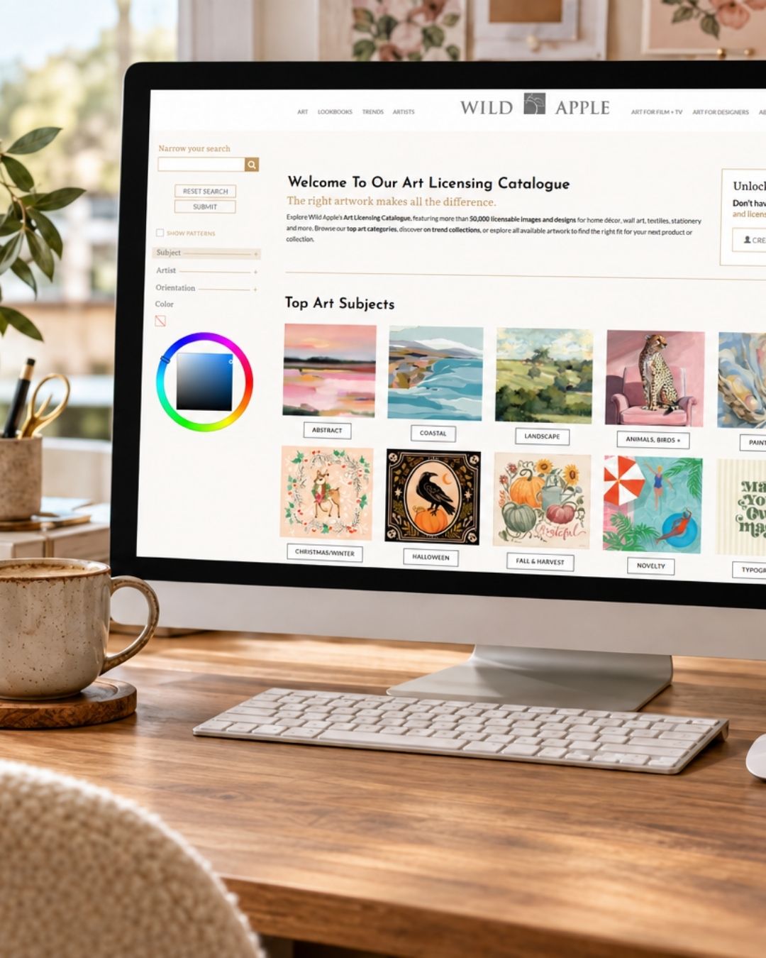
Which direction feels right for your customer: a little pink, a lot of bright or something warm and earthy? At Wild Apple, we work with artists to create Christmas and holiday art in a wide range of styles and palettes. Explore our online catalogue, start a portfolio and find inspiration for your next seasonal collection. Our team is here to help you bring your ideas together.